This concludes my time at Graphic Design as well as my time here at HTPA. I had fun working on every post and I am proud of my accomplishments. Thank you for taking the time to read my website.
Racial Discrimination in the work place – OTS & UTS
OTS:
- Which races are most affected by racial discrimination in the work place?
- Where are people more likely to face racial discrimination in the work place?
- What are some examples of racial discrimination?
- When did some movements to stop racial discrimination in the work place occur?
UTS:
- Why is racial discrimination such a big deal in the workplace?
- Could racial discrimination ever come to an end when it comes to hiring minorities?
- How can racial discrimination in the work place be prevented?
- Would more companies hire more minorities if there was a consequence for not doing so?
Visual Metapors Example
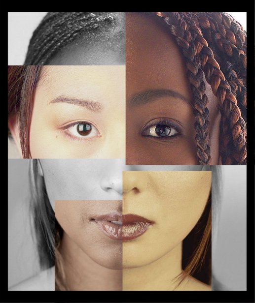
Topic: Racial Discrimination This visual metaphor in this image is comparing the six different races of the women and how they are all equal and the same.
This image is showing a group of people in a circle excluding someone else of a different color. This metaphor is comparing what people go through everyday when it comes to discrimination.
This visual metaphor is an image of children of different races in a circle. This is comparing how people of different races are all equal and are one.
Art Critism
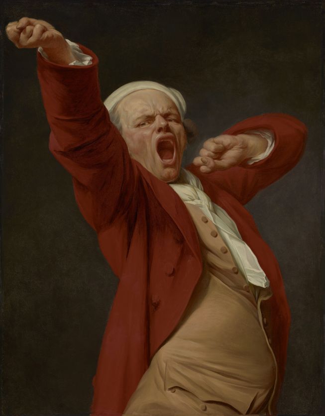
Self Portrait, Yawning
Joseph Ducreux
1783
Principles of Design
- Balance: The painting is asymmetrically balanced because the man’s body is an organic shape and organic shapes are not always symmetrical. However, his body looks natural and creates a balance through the use of a shape we are all familiar with.
- Emphasis: The man is the one being emphasized in the painting, especially his facial expression and outstretched arms.
- Movement/Rhythm: The man is stretching his arm out towards the viewer and yawning and this creates a calm feeling.
- Pattern/Repetition: There is a repetition of buttons on his shirt to give more detail to the painting and make it more realistic.
- Unity: All the colours come together by combining warm colours with neutral colours to make it seem complete.
- Contrast: The colour of the man’s clothes on the black background make him stand out.
A History of Graphic Design
Postwar Graphic Design
1960’s
Postwar graphic design was based entirely on antiwar propaganda. Along with the antiwar movement, other social movements emerged from the current political upheavals. These upheavals, the civil rights movement, women’s movement, environmentalism and the Vietnam War, were accompanied by poster art addressing these issues. Advertisements on radio and television were only able to be used for the wealthy, so normal citizens, independent and social groups, printed posters and flyers to help their causes. In addition to music growing in popularity, graphics for this part of entertainment appeared with a focus on design creativity. The person at the forefront of this was Milton Glaser, who “captured the imagination of a generation with his stylized curvilinear drawing, bold flat color, and original concepts.” In time, Milton expanded his reach to magazines, restaurants, retail stores and visual identity systems.

Links:
Manuscript Design in Antiquity & the Middle Ages
Graphic Design in the 20th Century
Postwar Graphic Design


